
These are flags that I designed/redesigned; they are all fictional or unofficial and should not be used in any capacity including official representation or replacement of official flags. Most have been entered in flag design contests either online or through flag committees.
Any other use of graphic material found on the site including mirroring or copying any part of the site is prohibited without express written consent. Visitors are permitted and encouraged to link to this site. You are welcome to link to any page or section of the website. Any form of reproduction, electronic or otherwise is strictly forbidden without prior written consent. If you have any questions about these terms or would like information about licensing images and/or materials, please contact me.
Ilocos Norte, the Philippines (in the style of San Marino)
As one of the many “seal on a bedsheet” flags in the Philippines, Ilocos Norte is similar to most, if not all of the other provinces in the country where they have their seals on their flags. This is a redesign of their existing flag to simplify and create a cohesiveness of the elements within the flag.
Positioned in the center of a white “bedsheet” it is described as the official designated provincial shield for the Province of Ilocos Norte. The blue background was added at the bottom to break up the monotony of the white. Removed was the year 1818, it was the year when the Royal Decree was promulgated dividing Ilocos into provinces, Ilocos Norte and Ilocos Sur. Flanking the shield are garlic, tobacco, and rice stalks. The abundance of garlic and rice production is exported to other towns and serves as the main source of living for its townspeople. Tobacco leaves, from the tobacco industry, are also one of their primary exports. In the middle is Paoay Church; it is one of the most famous attractions in the province. The church is a Baroque style architecture known for its earthquake-proof design buttresses and has been included in the UNESCO World Heritage list.
(To simplify this flag design, the following were removed from the seal: the windmills are a source of electricity for the towns of Ilocos Norte; another tourist attraction in the town of Bangui. Patapat Bridge is a kilometer-long scenic road facing the South China Sea, one of the top tourist spots of Ilocos Norte.)
The flag description was taken from the Registry of Government Seals of the Philippines.

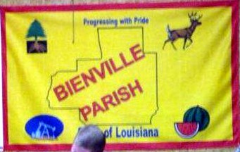
Bienville Parish, Louisiana (redesign)
The redesigned flag of Bienville Parish still has most of the elements from the current flag, except for the red edge.
This flag has a yellow background, containing in the center an outline map of the parish. All the texts have been removed. Over the map is an outline of a deer head. Above the deer is a sliced watermelon, and behind the map/deer are evergreen trees.
The bottom third of the flag are oil droplets, to replace the oil derrick in the current flag.
Description of the current flag
A yellow flag, edged in red, containing in the center an outline map of the parish and the name in red, above the motto, Progressing with Pride, at the bottom, State of Louisiana, and in the four corners, a tree eradicated, a deer, a watermelon (whole, and a slice), and an oil derrick in front of a blue oval.


Avonlea
Avonlea is a fictional community located on Prince Edward Island, Canada, and is the setting of Lucy Maud Montgomery’s novel Anne of Green Gables, following the adventures of Anne Shirley, as well as its sequels, and the television series Road to Avonlea. In Montgomery’s works, Avonlea is located on the northern shore of Prince Edward Island on a small peninsula. Its primary industries are farming and lobster fishing.
A huge influence of the flag of Avonlea comes from the flag of Prince Edward Island (PEI) itself. The flag of PEI is defaced with three oak saplings (young trees) and a large oak tree on a green island in the bottom portion. The flag of PEI in turn was modeled after the province’s coat of arms (COA). In the COA of Prince Edward Island, the large oak tree symbolizes England, while the three oak saplings epitomize the three counties that constitute the province. Therefore, since Avonlea is a community within one of the counties (Queens County) of PEI, the flag consists of oak leaves and an acorn in the center. Where the oak saplings in the COA are interpreted as the “descendants” of the British oak tree, then, therefore, the acorn (Avonlea) is a descendant of the oak sapling. The oak leaves surrounding the acorn represent the other towns and communities that are surrounding Avonlea.
The color green as the background can be interpreted as originating from “green gables” where Anne had lived. Additionally, the green background can also be attributed to the island on which the trees on the PEI COA are planted, which represents Prince Edward Island and Great Britain, which are both islands.


Gotham City
The flag of Gotham City, which exists and was flown in some of the Dark Knight movies and in Batman comics, was redesigned and simplified. Based on the flag of New Hampshire*, this flag has 13 small golden-yellow stars representing the original 13 colonies of the United States. In the center is a disc with a sailing ship on the sea, presumably carrying the colonists arriving in the New World, which was around the time when Gotham was founded (from the Swamp Thing #53).
Finally, the two swords behind the ship represent the motto of Gotham City, Ense Petit Placidam, Sub Libertate Quietem (“By the Sword, We Seek Peace, But Peace Only Under Liberty”), which is also the official state motto of Massachusetts.
*Gotham City however is technically in New Jersey, near the Delaware border/river, according to Atlas of the DC Universe (1990).

Flag of Mayan Languages
The Mayan languages form a language family spoken in Mesoamerica, both in the south of Mexico and northern Central America. Mayan languages are spoken by at least 6 million Maya people, primarily in Guatemala, Mexico, Belize, El Salvador and Honduras. In 1996, Guatemala formally recognized 21 Mayan languages by name, and Mexico recognizes eight within its territory.
The flag of the Mayan languages consists of the “burden of time” in the center, a logo-syllabic Maya script most commonly found on the Mayan calendar. In this context the ‘day’ being carried implies the start of the whole calendar year so the load carrier is actually the ‘year bearer’. Ancient Mayans used hieroglyphic texts such as the “burden of time” as their writing system.
The colors of the flag were derived from the Mayan Flag, which consists of four colors: white (peace), blue (sky), yellow (sun), and red (fire) and is divided into four fields.
United Nations (Redesign)

The Knotted Ribbon
This flag consists of white ribbons, which also resemble the iconic Knotted Gun sculpture (officially named “Non Violence”) found at the entrance of the United Nations headquarters in New York. Similar to the white ribbons and the Knotted Gun, this flag symbolize the UN’s commitment to peace the world over.

The White Dove
The white dove carrying a branch of olive plant symbolizes love, peace, and as a messenger of hope. The white dove is a symbol of peace, usually, found in many cultures and religions. The olive branch is a symbol of peace and victory dating back from ancient history. The United Nation’s aim is to maintain international peace and security, develop friendly relations among nations, and cooperation.

Naqaỹa
Design entry: flags of exoworlds.
The Naqaỹa planet is found in the Constellation Puppis (Latin for poop deck, or ship’s aft), found in the greater Constellation Argo Navis, which was the ship in Greek mythology sailed by Jason and the Argonauts to recover the golden fleece. The flag represents the intricate design of the Argo Navis and Puppis’s deck, as well as the waves that batters the ship endlessly, which also guides the ship in reaching its destination. The star represents the planet Naqaỹa, and the color purple represents space and the further scientific exploration that humanity has to conduct in reaching a habitable planet. Naqaỹa or “brother-family-relative” is an exoplanet found in the Nosaxa solar system and are both in the Mocoví language of the indigenous peoples of Argentina.

Poles in Chicago
Polish immigrants (or Polonia) to the Unites States are mostly concentrated in the Chicago, Illinois area (as well as New York City). Poles have been immigrating to Chicago since the 1830s, during the November Uprising (or the Polish-Russian War) and have contributed to the achievements of the city from its very beginning. Polish is the third most widely spoken language in Chicago behind English and Spanish. This flag is quarterly divided, and in the upper hoist and lower fly, it has the coat of arms of Poland with a red background. Alternatively, the upper fly and the lower hoist consist of Chicago’s four red six-pointed stars with a blue background from blue bars of Chicago’s flag.

Little Havana (Redesign)
This is sort of a redesign of the existing flag of Little Havana however, this flag is more representative of the Cuban citizens who are dissidents of the Cuban regime, and are currently living in Miami, Florida. The flag resembles the Cuban flag, which has been prominent in recent months in rallies and marches across the United States and other countries. The triangle consists of a rooster holding “The Key of the Gulf”, the symbols of dissidents in Miami, looking up at the distant star, which represent Cuba seen from a distance from across the Straits of Florida.

Haiti (Redesign)
L’Union fait la force (or “Unity Makes Strength”) is the motto inscribed on the coat of arms of Haiti. This flag is a simplified flag of Haiti consisting of a reconstructed coat of arms with six draped flags, three on each side, a palm tree, and a drum flanked by cannons on each side.
I’ve looked at the flag of Haiti in contempt for years, and I now have this opportunity to present to you how I’ve envisioned my simplified version.

Arlington, Virginia County Logo
Design contest entry (2021)
The proposed logo, seal, and flag(s) of Arlington, VA have a cohesive nature in their designs, consisting of three native dogwood blossoms, representing the past, present, and future of the county, as well as the diversity, inclusion, and unity of its people. The color blue (dubbed as Arlington blue) in the logo, seal, and proposed flag(s) represent the Potomac River, where, on its southwestern bank across from the U.S. Capital, Arlington is situated in.
On the flag(s) proposals, wavy shapes were particularly accentuated to emphasize the importance of the Potomac River and the location of Arlington in proximity to Washington, DC, in our past and in the future. In one variant of the flag, yellow is included which stands for forward-thinking mindset and community.

Howard County, Maryland
I redesigned the flag of Howard County, Maryland to depict a cleaner and more modern design. No copyright infringement is intended. It is described as “a red and white design which incorporates part of the Maryland flag.” The colors also reflect the exact colors of the flag of Maryland, including red and gold.
In the top left quarter, a “sheaf of wheat in gold symbolizes the agricultural heritage of the County” which can also be found on the original seal of Howard County dating back from 1840. The bottom left quarter depicts a golden triangle “symbolizing the unique position of Howard in the future development of the eastern seaboard.”
The current flag of Howard County, Maryland was established in 1968 through a contest and was designed by Jean O. Hannon.

Monongalia County, West Virginia
Flag design contest entry (2017)
Monongalia County Courthouse is the most distinctive and recognizable symbol of the county. Incorporated on the county seal, the courthouse is one that is loved by our residents and enjoyed by our visitors. The year 1776 was included to signify the county’s creation by an act of the Virginia General Assembly that year.
Continue reading my thought process for this design entry in my blog.
